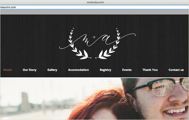
Entries in logos (6)

Tuesday
Dec032013

Recent Work

Though the blog has been quiet, behind the scenes has been anything but. 

Here is a quick peak at a few recent projects both big and small...

A painted and calligraphed logo:
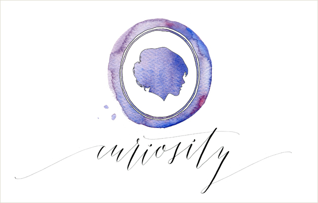
A post by Kelli Hall for Minted's blog Julep featuring five calligraphers and our styles, check out the full post here:
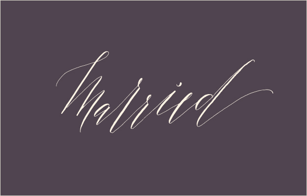
Calligraphy for Lilikoi Design + Letterpress' line of cards, more details and photos to come! :
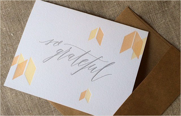
Designed and letterpressed by Lilikoi Design + Letterpress // Photo from Lilikoi's tumblr

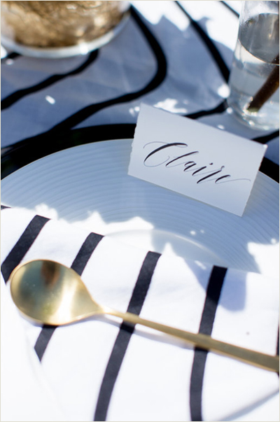
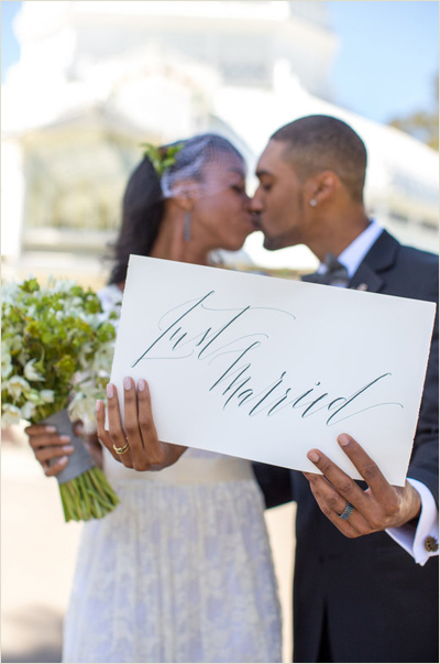
Place cards, table name and signage for Locally Grown Weddings' stunning photoshoot at the Conservatory of Flowers:
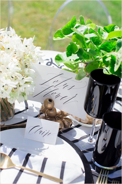
Locally Grown Weddings Collective // Planning: Sadie Waddington // Food: Chef Stephanie // Flowers and Styling: Madeline Trait // Photography: JennaBeth Photography // Hair & Makeup Artist: Chava Nieto, Hair to Dye For // Cake: Cake Bloom // Rentals: Hartmann Studios // Specialty Linens: The Swede Life Shop // Tie: This Humble Abode // Bow Tie: DIBI ties // Dress: KT Jeans Designs // Jewelry: Betsy Barron // Veil: Simply Bridal // Invitations: JennaBeth Photography // Cuff Links: By Madeline Trait

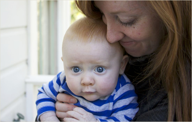
And finally, my biggest piece of work yet...sweet Benjamin:
 
Wednesday
May222013

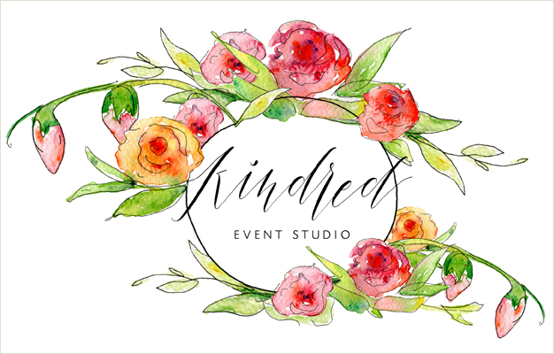
Kindred

Emily Paben—you'll remember her original logo here—recently joined forces with Sara Martin to create an event planning studio that makes sure your party will be "the one guests want to come to and don't want to leave." (Invite me!) 

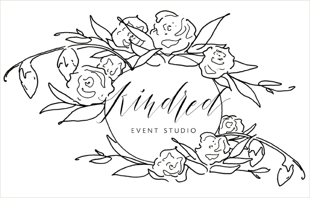
So, as we bid adieu to her former design and its yellow confetti, we said hello to an explosion of flowers and whimsical calligraphy. Along with the painted logo, I created a suite of additional elements for use in their rebrand—a line drawn version, a watercolored K, and a few swishes and circles to use under text. 

I love when the design process includes a wonderful, talented client...and an excuse to walk through neighborhood gardens for inspiration and, quite literally, stop to smell the roses. 

Monday
Mar042013

Ready For Business

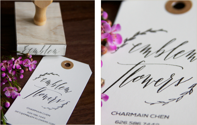
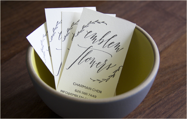
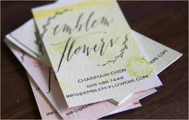
I'm loving this latest stamp project. Charmain is launching her floral business, Emblem Flowers, and ordered a stamp to make her own business cards. Brilliant! I designed and calligraphed her logo, included her contact info, and voila...insta-business cards. 

She can now stamp her information onto most anything—simultaneously calming fears of running out of business cards at the last minute and opening doors to endless printing possibilities. I had a little fun experimenting before shipping the stamp out—looks great on manilla tags, card stock (any color!), I even did a watercolor wash and stamped right over the paint. Pretty pretty. I am daydreaming of more potential...this lime chalk inkpad on dark card stock? Yes please. 

Thursday
Feb282013

Let's Be (Forest) Friends

It's been lovely working with San Francisco illustrator Lindsey Manwell—though we've only corresponded via email, it's clear that her personality is as beautiful as her illustrations.

For the launch of her new site, I calligraphed her name along with a set of titles for her upcoming collections—Forest Friends, shown here. How cute are those little faces? I'd be their friend.

Friday
Jan112013

Logos

Lettering has personality—organic, whimsical, playful, formal, cheerful, serious... I love playing with these characteristics to translate someone's brand, a website's mission, a blogger's style, into a hand-lettered logo. The logo becomes a small piece of custom art that can't be duplicated by a computer's font reserve, it is a unique reflection and representation of the individual.

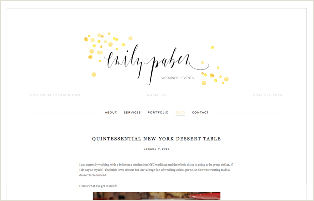
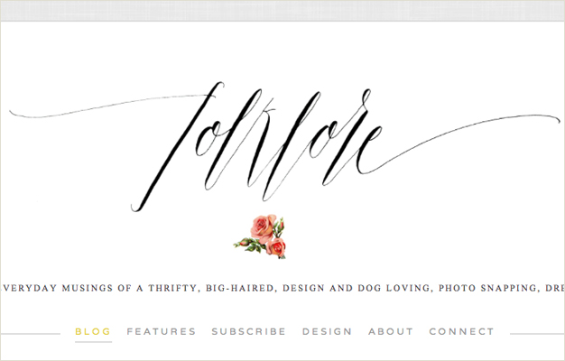
These are two pieces I recently completed that have just gone live. They are calligraphed in very different styles with very different personalities—Emily has a fabulous wedding and events business in Texas and Melissa has a beautiful blog in Canada.

Happy Friday, have a splendid weekend.

Monday
Dec032012

Logo Love

Such fun working with bride-to-be Mel again (you'll remember her engagement party invitations...)

Now that she has squared away her super classy venue, picked out a stunning gown, and selected colors—black and white with a touch of gold—we began creating a look and feel for her paper goods to complement all of the above.

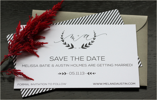
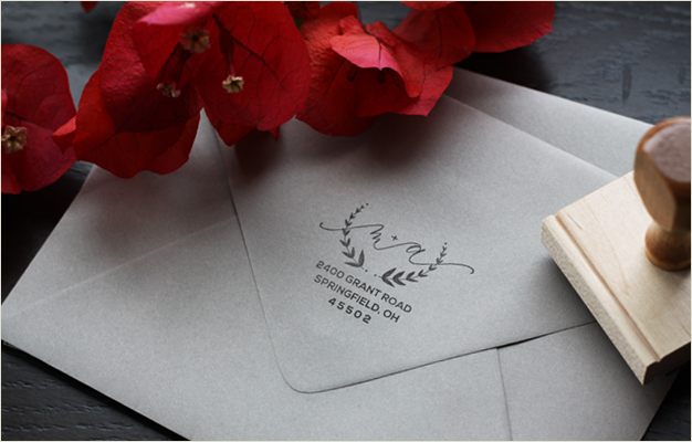
Mel loved the idea of having a logo or crest that would carry throughout the wedding, so after drawing up three different designs we landed on this winner. You see it here in the save the date (complete with a sassy striped back!), on her custom return address stamp, and wedding website. It's both modern and formal, sweet and fun...much like this bride and groom.